Arturo + Lauren
An International Couple creates their LA home in their style.
When a stylish young couple, Arturo and Lauren Engel, recently purchased a house in Los Angeles, they knew they needed to put their stamp on it. The problem was that the house was a boring beige color, which did not match the creative and artistic personalities of the couple. The Engels are international professionals that are split between Los Angeles, New York, Hong Kong, and Spain. Arturo, having grown up in Mallorca, and Lauren in Hong Kong. Both work in the architectural photography industry, they were very passionate about architecture and design, but didn't quite know where to start with their own home.
After reading an article about Justina Blakeney in Architectural Digest Magazine, they were impressed by the talented designer's use of Sydney Harbour paints in her projects. They were eager to find out more and decided to book an appointment with Sydney Harbour’s Mahana Ray, the brand's expert in color selection. Mahana immediately put the couple at ease, guiding them through the various colors and finishes available and discussing their personal style and preferences. The couple was amazed by how much more they were able to achieve with the right color palette and finish, and felt inspired to breathe life into their new home.


The living room was painted in "Old Moss," a warm and earthy green that worked perfectly with the couple's contemporary furniture and brought a natural element to the room.


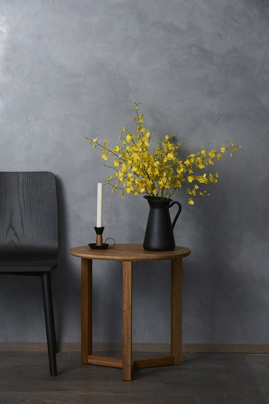
The study (yellow room) was painted in "Lime Wash Roman Ochre," a sumptuous and rich yellow that provided a sense of luxury and a pop of color.


The family room was painted in "Neroli," a light, pale midtone with slightly peachy-orange that helped to connect the indoors with the outdoor spaces of their home.


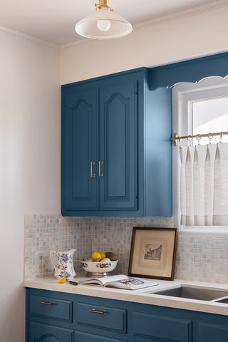
The kitchen was painted in "Aswan," a beautiful blue that complemented the stainless steel appliances and quartz countertops.


The primary bedroom was painted in "Atlas," a rich and sophisticated shade of blue that provided a stunning backdrop for white linens and natural wood furniture.


The guest bedroom was painted in "Library Red," a bold and dramatic choice that added character and personality to the space.


Lastly, the hallway was painted in "Anchorage," a muted and cool hue that brought cohesiveness to the entire space.
The couple was overjoyed with the results and felt that their home perfectly reflected their personal style and preferences. They were thrilled to have moved away from the conventional beige color to a more vivid color palette. The unique shades and finishes they found at Sydney Harbour Paint Company added character, depth and personality to their home.
“Working with Mahana Ray, we were able to create a custom color palette that reflected our unique style and personality. Justina Blakeney's endorsement of the brand was well deserved as it had guided us to choose Sydney Harbour Paint Company. We could not be happier with our newly painted home that now reflects our love for architecture, design and creativity.”